
After much dithering, I’ve decided to look back on the first cover of each of Margaret Atwood’s novels. There have been many different covers for her novels over the years. Let’s have a look at a small sampling…
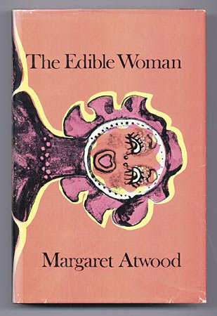
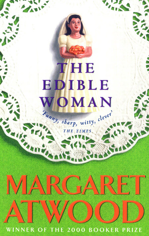

The Edible Woman – McClelland & Stewart (1969), Virago (1980), Bantam (1991),


Surfacing – McClelland & Stewart (1972), Virago (1979), Bantam (1995)
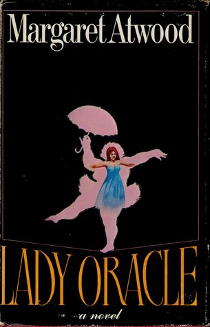

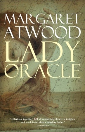
Lady Oracle – McClelland & Stewart (1976), Virago (1982), Emblem Editions (2011)


Life Before Man – McClelland & Stewart (1979), Bantam (1980), Vintage (1996)

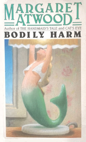

Bodily Harm – McClelland & Stewart (1981), Bantam (1983), Emblem Editions (2010)


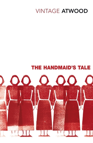
The Handmaid’s Tale – McClelland & Stewart (1985), Fawcett (1986), Vintage Classics (2010)
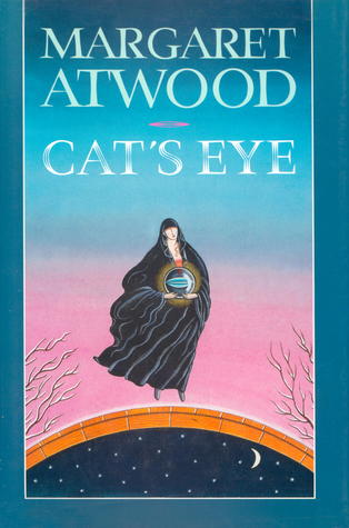


Cat’s Eye – McClelland & Stewart (1988), Virago (1996), Anchor (1998)
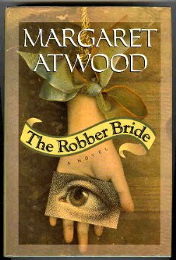

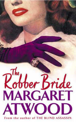
The Robber Bride – McClelland & Stewart (1993), McClelland & Stewart (1998), Virago (2002)


Alias Grace – McClelland & Stewart (1996), Emblem Editions (1999), Bloomsbury (2017)


The Blind Assassin – McClelland & Stewart (2000), Virago (2001), Emblem Editions (2003)
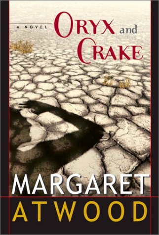

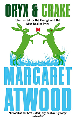
Oryx and Crake – McClelland & Stewart (2003), Anchor (2004), Virago (2013)


The Penelopiad – Knopf Canada (2005), Canongate (2006), Canongate (2006)


The Year of the Flood – McClelland & Stewart (2009), Bloomsbury (2009), Virago (2013)

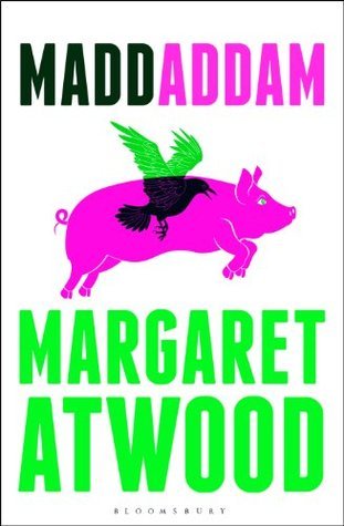

MaddAddam – McClelland & Stewart (2013), Bloomsbury (2013), Random House Anchor (2014)


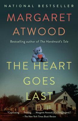
The Heart Goes Last – McClelland & Stewart (2015), Virago (2016), Anchor (2016)


Hag-Seed – Hogarth (2016), Hogarth (2016), Hogarth (2017)
I like seeing the older book covers – there are a lot I don’t recognize. The covers of the recent books are more recognizable.
Do you enjoy looking at cover images over time? Do you think some suit the story better than others? Do you have a favourite?
THE SCHEDULE FOR MARGARET ATWOOD READING MONTH:
November 1: Beginnings (Links to this event can be found here (Naomi) and here (Marcie).)
November 8: Cover Images (hosted by Naomi at Consumed by Ink)
November 15: Favourites (hosted by Marcie at Buried in Print)
November 22: Quotations (hosted by Naomi at Consumed by Ink)
November 29: Endings (hosted by Marcie at Buried in Print)
November 30: A Round-Up of links collected from participants
You can find more information about this event in our announcement post here and here.
Remember: These weekly themes are in addition to any book, story, poem, essay, interview, article, etc. you want to read (or watch) over the month and discuss on your blogs or on Twitter. #MARM
Happy Reading!

Lovely post, Naomi. Atwood through the ages! Some of these have br
Oops! Fingerslip there… I meant to say some of these have brought back happy reading and bookselling memories. Thank you.
I had a lot of fun looking through them for similar reasons. It was hard to decide which ones to use!
Yes, I recognise some of those and have them on my shelves.
But it’s interesting that even someone of the stature of Margaret Atwood has had some pretty dire covers…The Anchor edition of The Heart Goes Last (2016) is woeful, the McClelland Stuart one for The Handmaid’s Tale is awful (1985), and I don’t like any of them for The Edible Woman.
I think my favourite is the Canongate edition of The Penelopiad (2006).
Some of them are pretty bad, aren’t they? I don’t know why the first Handmaid’s Tale cover is so different from all the rest that followed. And I think if someone picked up that Anchor edition of The Heart Goes Last, they might be expecting a completely different tone from the book.
I love this post, and I agree that some of the older ones are more appealing.
Oh my gosh, that Virago cover for The Robber Bride! I would make all sorts of incorrect assumptions about a book that looked like that, if I didn’t know the author. It is hard to believe a cover like that came out in 20002. Wow, some of these are… special.
I was surprised by that one, too. I had never seen it before.
I love looking at book covers, and delving into the thought (or lack thereof) that goes into their creation … and these? Oh, my, no wonder I’ve never read an Atwood novel. What have green bunnies got to do with anything?
Well, actually, there are green bunnies in the book! I think they might even glow in the dark? I can’t remember. But, I agree with you on many of the other covers. It’s no wonder I didn’t feel inspired to read any of her books until I was into my twenties (and knew by then that you can’t judge a book by its cover)!
I think that trope must have benn written with MA covers in mind! And now you’ve told me about glowing green bunnies, I have to research that book.
Haha!
I haven’t read all these books, but the idea of what the book may be about is really different for the different covers, especially the ones I’m not familiar with. I think I read The Robber Bride, although I can’t remember it, but the cover on the right makes it look like a florid romance novel, and you know that can’t be right. I decided to read the Madaddam trilogy pretty much based on the cover of the third book (the one on the left) and had to go back and find the other two first.
It’s interesting how much the book cover affects what we decide to read, or what we think the book might be about. I would never have read The Robber Bride, if that had been the cover I saw!
Yes, that’s true.
My word, the artists must have had a field day with the draft designs for some of those early novels, The Edible Woman and Boldly Harm in particular. I really like the covers for The Penelopiad – they’re beautiful. Lovely post, Naomi!
It’s really quite fun to have a look at the variety of covers, isn’t it? Thanks for visiting, Jacqui!
I love looking at cover art through the years! The original Handmaid’s Tale cover is bizarre, but the Fawcett cover is so iconic now.
I was really surprised by that first Handmaid’s Tale cover – I had never seen it before – I thought the Fawcett cover was the original!
So many covers! And the editions that I’ve had were different again.
I think that the image of the red gowns against that grey wall on The Handmaid’s Tale has to be one of the most striking covers of all time.
I confess that I kept a hardback copy of Bluebeard’s Egg on my bookshelf for 30 years because the cover was just so beautiful. I finally admitted to myself that, no matter how lovely it looked, I just wasn’t going to read it. After all, it was Atwood. It went in the first cull to a small used-book shop in the village.
I had to look up the Bluebeard’s Egg covers to find the one you liked so much. Is it the one with the women holding an egg?
Yes. There’s just something about the colours that enchanted me.
I like the themes of all of the MaddAddam books. They were clearly designed together. I also like the cover of Cat’s Eye with 2 girls whispering better than the floating lady. I know the floating lady is important for a while, but the whispering girls stands out more…. Overall, the book is so unfocused that the cover won’t capture it all.
I like the whispering girls better, too.
And, I agree, I like that the MaddAddam books look like they belong together.
Wow, what a mixed bag! Some of those are fab, but others are so dated, aren’t they?
Absolutely!
She has had some truly bizarre covers over the years! Some of the 1960s-70s ones, especially, make me laugh. I recognize a few of them from my shelves and my library borrowing. My cover of The Edible Woman is disappointingly boring – just some legs in socks. I’ll post a photo when I review it.
When I read The Edible Woman, it was the one with the fridge on the cover – just seeing that cover helps me remember the story a bit. Weird how that works!
Gorgeous post, Naomi: I’m having so much fun browsing through them and feel like I notice different ones each time I scroll through. I’m struck by how prominent the female form is during the early years and how they seem to become more abstract (perhaps because publishers have moved to stock photos rather than commissioned or existing art?). That cover for The Robber Bride does make me laugh, but I also feel like Zenia would surely approve (it must be her on there)! And I am partial to the Life before Man with the ammonite shape where the woman’s brain because I’m actually reading the middle cover and now when I look at it I imagine an ammonite in Margaret Atwood’s brain too.
That’s a funny connection to make between the two covers!
What I noticed going through them all is that when I saw the ones I had read years ago, it helped me remember more about the book and how I felt about it, and even what was going on in my life when I was reading it. All thanks to the cover!
Fascinating post Naomi! I think it shows what a versatile writer she is that different covers for the same book pick out such different elements. Although some you wonder what they were thinking – the first 2 for Life Before Man are pretty dire, the third one I’m attached to because it’s the version I own 🙂
We are always attached to the ones we own, aren’t we? 🙂
That’s a good point about the number of different covers that work show how versatile she is. (And also how popular!)
Many of these covers seem to butcher her books! Yikes. My favorite ones you show here are: Alias Grace (first one on left) and Oryx and Crake (first one on left). The canoe cover of The Surfacing isn’t bad … but it doesn’t get the whole sense of the story either. I think covers are really important. I’m surprised that many of these seem to miss the mark.
I wonder if it’s because there have just been so many of them over the years.
I feel partial to the second cover I included for Surfacing – but I doubt that it adequately reflects the story. I’d like a cottage with a red door, though!
I love seeing some of the old covers! Some of these are just soooo 80’s. lol. I do love a lot of her newer covers, though – especially the newer paperbacks that look lovely on a shelf together. I need to get some more of Atwood’s work – I think I have two on my shelf to read and then I’ll have to get a few more. Probably not some of those crazy vintage covers though. lol
It’s fun to be browsing in second hand book stores and come across old copies of Atwood’s books – you never know which editions you’re going to find!